
Monthly Seoul Sinsa
2025
WORKSCOPE
Brand Strategy, Art Direction, Branding, Graphic Design
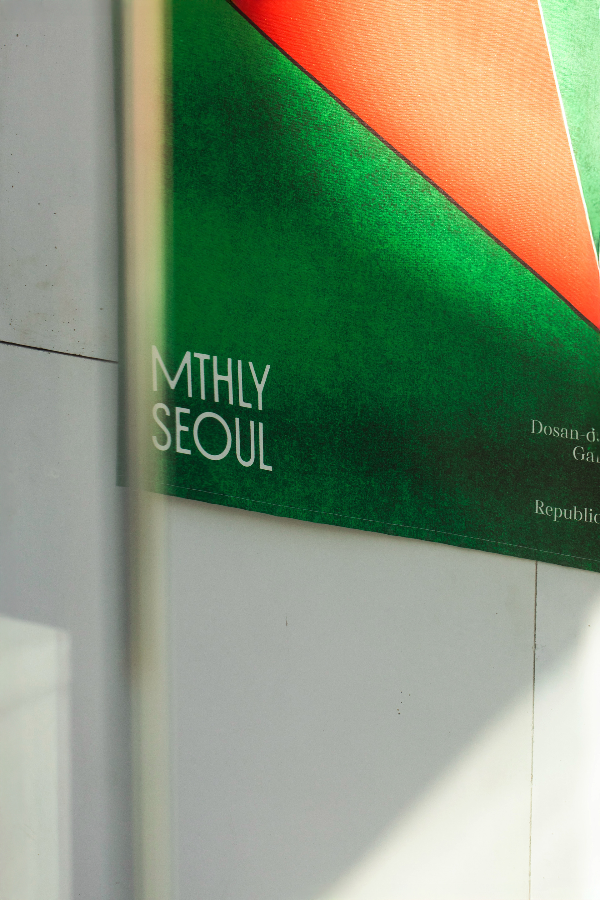
Following the branding of the Monthly Seoul, we have developed the brand identity for the new Sinsa branch.
We focused on the essence of Garosu-gil in the early 1980s—a time when artists and designers cultivated culture at their own deliberate pace.
While maintaining the core identity of Monthly Seoul, the logo for the Sinsa branch introduces a new layer through the keyword "Overlapping." Much like the overprinting technique where multiple colors layer to create an entirely new hue, we visualized the moments of "overlap" where the heritage of the flagship meets the present of Sinsa, and where designers and customers converge.
Instead of contrived perfection, natural misalignment serves as the primary visual language for Monthly Seoul Sinsa. Through the lighthearted separation of strokes, we have infused the brand with Monthly Seoul Sinsa’s philosophy: transcending the role of a simple salon to become an experimental cultural space.